Choose the words and reading direction
Write the exact inscription and say whether it should run along the top or bottom of an arc. For a lower arc, specify whether the letters must remain upright when the object is viewed from the front.
Curved lettering
A curved text stl generator starts with a simple idea: letters should follow an arc rather than sit on a straight baseline. Describe the shape you want, then inspect the resulting 3D text before treating it as a printable part.
Straight text is often enough for a label. An arc calls for three extra decisions: how far the words travel, which way they face and what supports them.
Explore how lettering and a backing can work together on a small personalized object.
Review the checks that matter when a text model must become a physical print.
Follow the broader workflow from a text idea through model inspection and slicing.
Start with the words, describe their path, and decide how the finished lettering should connect. Those choices make a prompt more useful than simply asking for curved text.
Write the exact inscription and say whether it should run along the top or bottom of an arc. For a lower arc, specify whether the letters must remain upright when the object is viewed from the front.
Say whether you want a shallow curve, a semicircle or lettering around a full ring. Short words may need generous spacing; a long phrase may need a wider radius to avoid crowding near its ends.
Ask for a plaque, ring or another backing if the letters need to form one connected object. If you want freestanding characters, plan how each piece will sit on the print bed or attach after printing.
Texttostl sends your description to a 3D text tool. Describe the intended shape, but verify the geometry you receive; a prompt is not a guarantee of an exact arc or a ready-to-print file.
A request such as “wrap this phrase around a 40 mm circle” describes your intent, but the resulting geometry still needs measurement. Do not assume a written dimension has been applied precisely.
WorkaroundMeasure the model in a CAD editor and adjust the curve there if it must fit an existing part.
Thin strokes, tiny gaps and disconnected letters may look acceptable on screen yet fail in a slicer or during printing.
WorkaroundInspect the mesh in your slicer, check minimum features against your printer and material, and add a backing where needed.
Characters on the inside of a tight curve can appear crowded, while those on the outside may look too far apart. The effect is especially noticeable with long phrases.
WorkaroundShorten the inscription, widen the arc or refine individual letter positions in a modeling tool.
Use these images to compare a general text object with a curved-lettering concept. They illustrate the design question, not a verified before-and-after conversion.
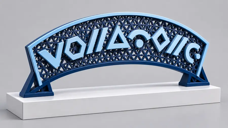

Before printing, inspect letter orientation, spacing and connections in the actual model rather than judging from an illustration alone.
Include the exact words, where the curve sits and whether the letters need a backing. Texttostl can take you to the 3D text tool to explore that concept; check the result for dimensions, connections and slicer suitability before printing.
You can describe lettering that follows part of a circle or a complete ring. Inspect the resulting model to see how closely it matches your intended path, especially if the circle must fit another object. Use a CAD editor for precise alignment when a measured radius is essential.
Specify the reading direction and say that each letter should remain upright when viewed from the front. This matters most for text along the bottom of a circle, where letters can otherwise be interpreted as rotated or upside down. Check the actual result before printing.
A tight radius gives adjacent characters less room, particularly along the inside edge of the curve. Try a wider arc, a shorter phrase or more deliberate spacing. If overlap remains, adjust the letter positions in a modeling tool.
Not always, but separate letters may become separate printed pieces. A plaque or ring can connect them into one object, while freestanding letters need their own stable bases or a plan for assembly. Check connectivity in a slicer before starting a print.
No. Even a model that looks right may have thin strokes, unsupported features or disconnected parts. Check its dimensions and mesh in a slicer, then choose settings appropriate for your printer and material.